Labs
Building an interface for tactile, responsive, and personalized mini textbooks
brief
Added an AI layer on top of a previous product, re-thinking it's use, and developing it from concept through launch.
My Contribution
- Designed core UI by simplifying interaction patterns
- Led product research, discovery, and synthesis
- Developed frontend and AI infrastructure
Built a responsive and multimodal interface for reading and learning via interactive and visual mini textbooks.
Role
Design Engineer
Functions
Product Strategy, UX Research, UI/UX Design, Frontend
Duration
6 months
Link to
This project began while experimenting if/how AI could be brought into a previous product.
Good news was it could! Bad news was we didn't know for what.
Discovered while tinkering:
- We could generate data compatible with our previous app
- Inside, users could further prompt to directly add content
Pictures here of some of the first generations

Early generated pages used a no-code tool requiring us to copy/paste a massive returned story data object, which included layouts, text, images, etc. into our codebase manually. Only working UI component was bottom left, generating content that we slotted into new pages.
Challenge
From a previous journalism product, understand how implementing AI changes its use, then design an interface for that use, and build a consumer-ready product.
Goal
Find a fitting problem space then
launch and try to grow.
Opening Research
Internal product review, studying AI trends, and exploring potential uses.
Product Review
Previous users liked the visual reading experience, but at times expressed the interface felt flat and unresponsive.
Secondary Research
Insights here informed who we sought to have further conversations with.
Exploratory Conversations
Many offered enthusiasm, but only a few expressed needs that might be addressed.
Education surfaced as the most compelling use:
Cognitive Offloading
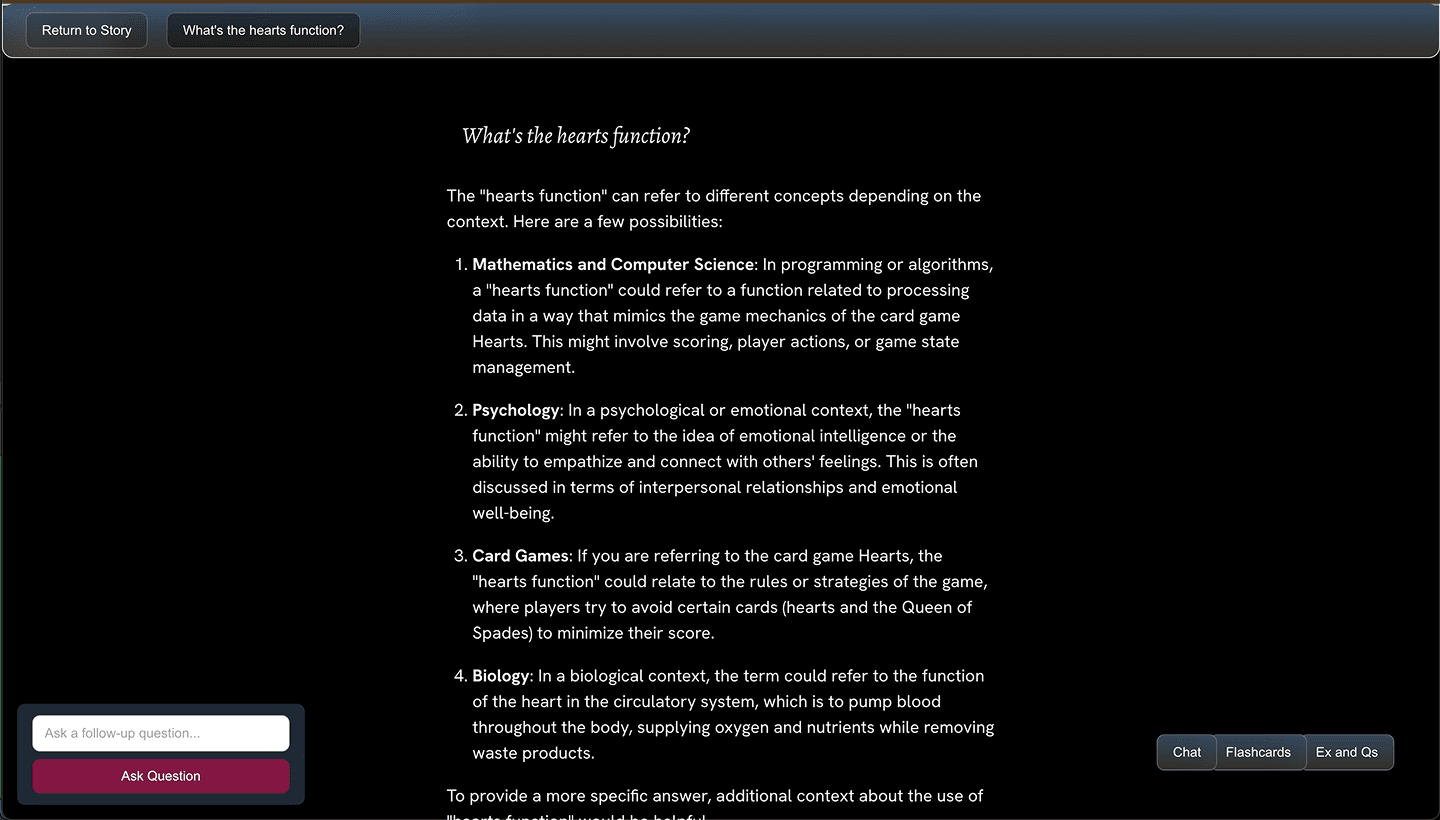
There was opportunity to create an interface designed around asking questions rather than providing deliverables.
Misalignment
Solutions in Ed Tech would likely be plural, and with room for different innovations tailored to different concerns.
Product concept:
Quick visual and interactive textbooks, where everything on page was responsive, enabling personalized learning journeys.
Prototyping
Zero to one prototyping to validate the concept and gather feedback.
With a cohort of high school students and teachers, we gathered early UX feedback and discussed why AI tools were or weren't working in their classrooms.
Primitive prototypes, but our priority was giving students freedom to create stories and explore, seeing if and how the app could become useful.
Though functioning, the product was an early prototype. The initial generation phase was unreliable and took 4-6 minutes, and the UI was more of a sketch. Critically though users could create accounts and save stories.
Insights:
Gen Time
We needed to shorten the response time, or add features.
Students ↔️ Teachers
The tool's interesting struggle to provide solutions was uniquely appealing to educators.
Levels of Depth
We wanted to design a surface that responded quickly, but could grow in any direction to any length.
Validating the Use
A tension between narrowing the use case, design, and roadmap at the potential expense of others surfaced.
Developing
Strengths of our interface were chunking info across pages, combining text and visuals, the play on interacting with anything, and (to teachers) its inability to write essays.
Everything else remaining in question:
- Design of the UI/UX across devices
- What types of questions this tool best answers, and how critical answering them is (an ongoing cat and mouse)
- Quickest roadmap to a usable, useful product
- Performance of the AI architecture
^ That is to say, pretty much everything. Continued prototyping and built this:
Cleaning the top region of the pages gave more breathing room for layouts. As users began moving through stories more naturally, we focused on improving microinteractions and animations.
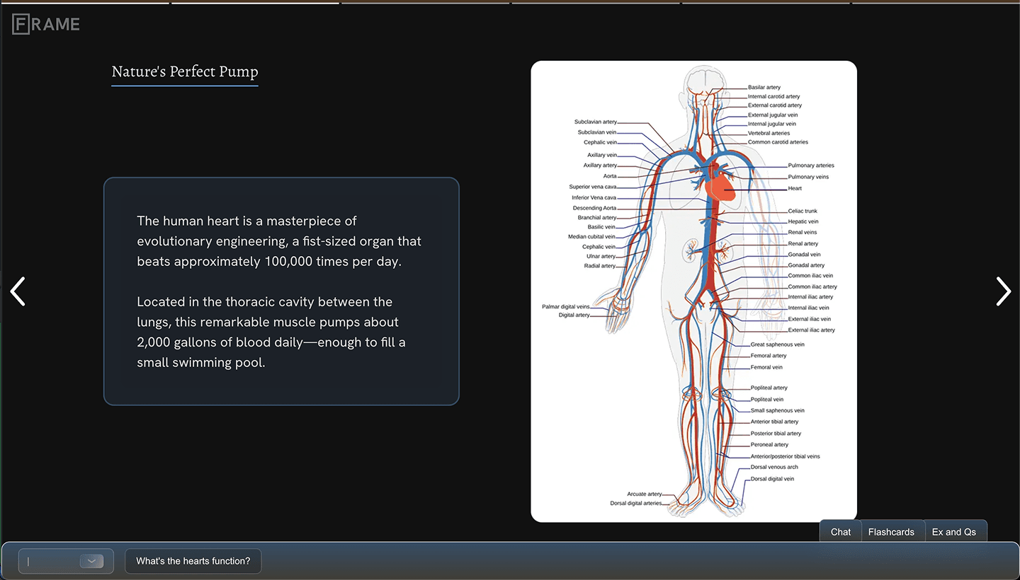
Toggle states add cleanliness, pages have highlights for legibility, and sources moved outside text blocks amongst other improvements.
** Some more notes and process below
The first UI, while functioning, was largely unclear how to use.
First to design was the UX for interacting beyond the initial generation.
For pace, I opted to skip Figma and code prototypes. Quicker rounds of live user testing and steady dev progress, at the expense of a maybe messier design process.
Desktop
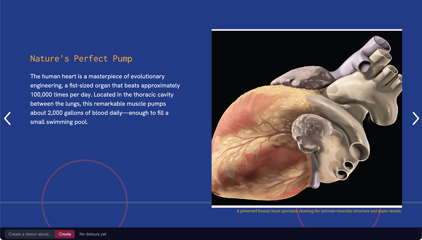
Early examples of generations and layouts here.
As we began designing, a fun interplay evolved between the improving underlying AI infrastructure, and the UI it served.
That, along with UXR feedback, incrementally shifted what we were designing for.
Early progress included establishing consistent layouts and UI iterations. Much time spent here on backend infrastructure - auth, accounts, storage, etc.
Example intermediate step in the right direction.
Generating suggestions was a good update, lowering the friction to prompt pages, but the first design was unclear.
Toying with nesting, consolidating controls, and ux writing.
Generating suggested branches was a good idea, both helpful contextually and in communicating the feature, but weren't quite intuitive enough. Also evident battles with text formatting.
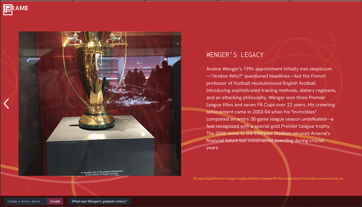
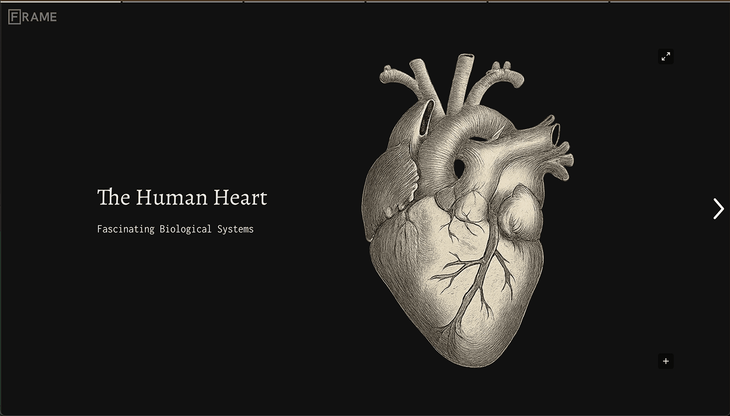
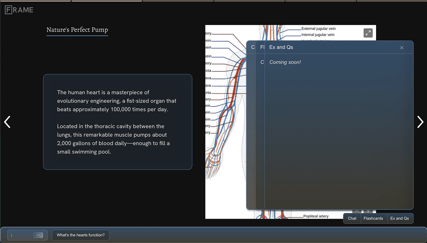
Current desktop UI whilst in a story.
A one-click action to the core function is highest in the hierarchy, giving users quick access to the feature.
Buoyed by suggested options and a prompt input box, we finally saw users navigating through stories intuitively.
Still haven't quite figured out the UX writing.
Toggle states add cleanliness, pages have highlights for legibility, and sources moved outside text blocks amongst other improvements.
Mobile
The product wasn't really useful on mobile with gen times north of 1-2 minutes, once we hit that milestone we started building a complimentary ux.
Still prioritizing a sense of tactility and responsiveness, but designing for shorter experiences and inquiries.
Cursor's adaptation of the first desktop ui - a starting point.
It worked, but crowded, confusing, and the page layouts needed some love.
Initially bringing in all of the desktop functionality, from here we began de-cluttering the UI, trimming and nesting features to provide a more focused UX.
Early UI mobile iterations followed desktop updates, while trying to strike the balance between utility and information overload for new users.
We wanted to give everything "juice" - pages, images, text boxes, controls, all to respond even if acutely.
Little wiggles, zooms, highlights all contribute to a sense of liveliness from the page.
The strict single-screen height of pages yielded dev challenges, requiring solutions which initially felt awkward, for example with the above input field. Also working on text-formatting, here for example sources are a bit disruptive to the text’s legibility.
Current UI designed for briefer experiences.
Organizing the model network for UX improvements, for example here leveraging a context object to enable the one-click action, making the core conversation feature easier to use.
Cleaning the top region of the pages gave more breathing room for layouts. As users began moving through stories more naturally, we focused on improving microinteractions and animations.
As the initial generation time shrunk from minutes to seconds, the product's intent changed, guiding the UI's design.
A simplified mobile environment
now successfully serves quick breakdowns, while still able to flex to deeper explanations.
A richer feature suite for the desktop
has more functions surrounding story pages and ways to interact with objects on them.