CMS
Evolving a no-code design platform for usability, smoother workflows, and external adoption
brief
Transforming an internal tool into a product ready for external adoption.
My Contribution
- Designed four new UX streams to guide development
- Provided high fidelity designs for tickets and contributed PRs
- Managed dev roadmap using user feedback to steer feature prioritization
Outcome
Took a manual, time-intensive process taking ~20 hours down to ~2, along with new features for improved consistency, reliability, and collaboration.
Role
Design Lead
Functions
UI/UX, Product Management, Development
Duration
14 months
Challenge
As the company pivoted to a B2B model, we needed to evolve an internal tool into a platform usable by external organizations.
The tool's strength was its quality of output; its weakness was inefficiency.
Goal
Refine the tool's core workflow for creating interactive articles.
If initially we had a manual, time-intensive editor, we were trying to create a printing press.
Pitch
The redesign aimed to tilt this balance in favor of publishers.
Three main areas for improvement:
Initial Input
Opportunity for automation here.
Positioning and Styling
As well a lack of positioning options meant some designs couldn't be created.
Iterating
Not needing a fully-flexible design tool, we had to create a custom concept for iterating.

New stories opened completely blank - pages and content blocks had to be added and configured one by one.
Even for practiced users, it took 30–45 minutes just to get content in place before any real layout or interaction design could begin.
User Interviews
Designers
Time-constrained, they prioritized efficiency and had a high bar for quickly producing designs adherent to style guides.
Editors
They asked for a new interface for easily updating text and swapping assets.
Defining priorities for the redesign:
- Automate the initial input UX
- Design a scheme to help users intuit how objects would behave responsively across changing screen sizes
- Establish a component system for both speed and consistency
- Create a new UX dedicated to editors
Surveying other design tools and interviewing designers, producers, and editors across newsrooms, we began mapping an updated UX —
Clustered ideas to loosely organized site maps to detailed hierarchical feature lists and user flows.
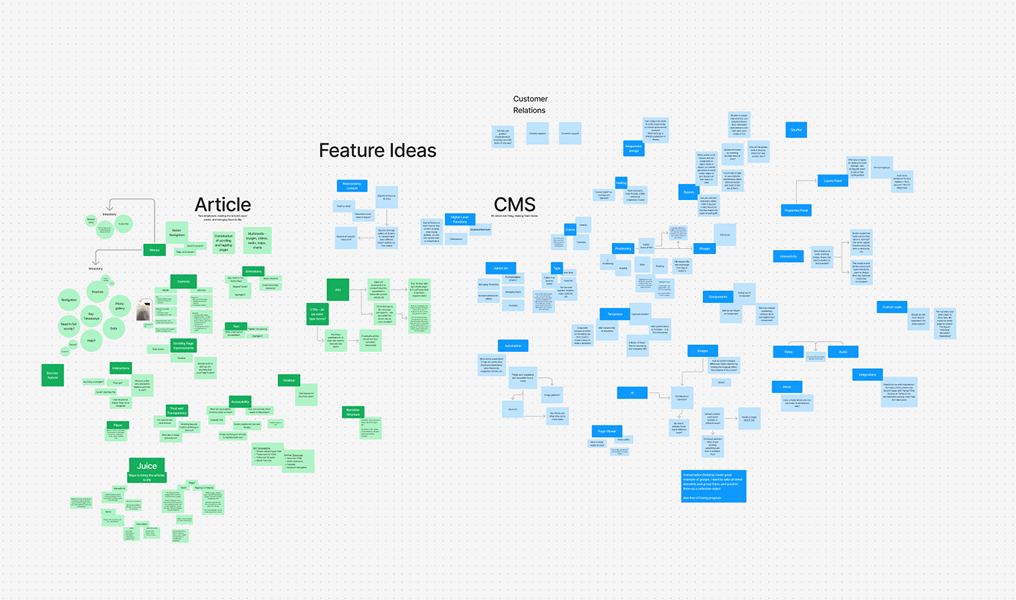
— and produced the following north star for development:

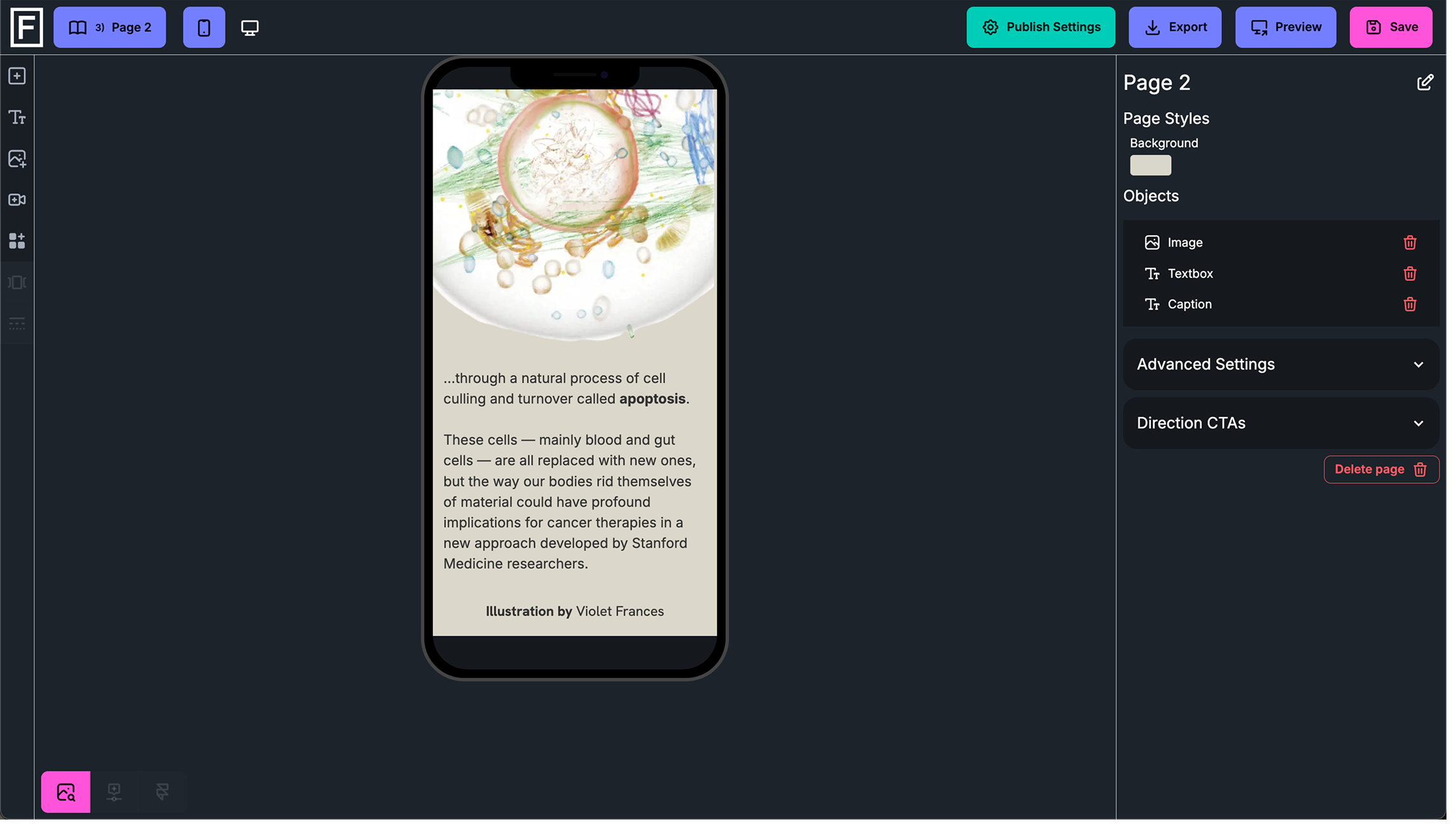
The stage was updated to better support active design work.
Users could view and edit multiple pages at once, and adjust screen sizes directly within the editor to test responsive behavior in real time.
As the above design led development, my tasks progressively shifted to:
Managing a Roadmap
Providing Acute Designs
Contributing PRs
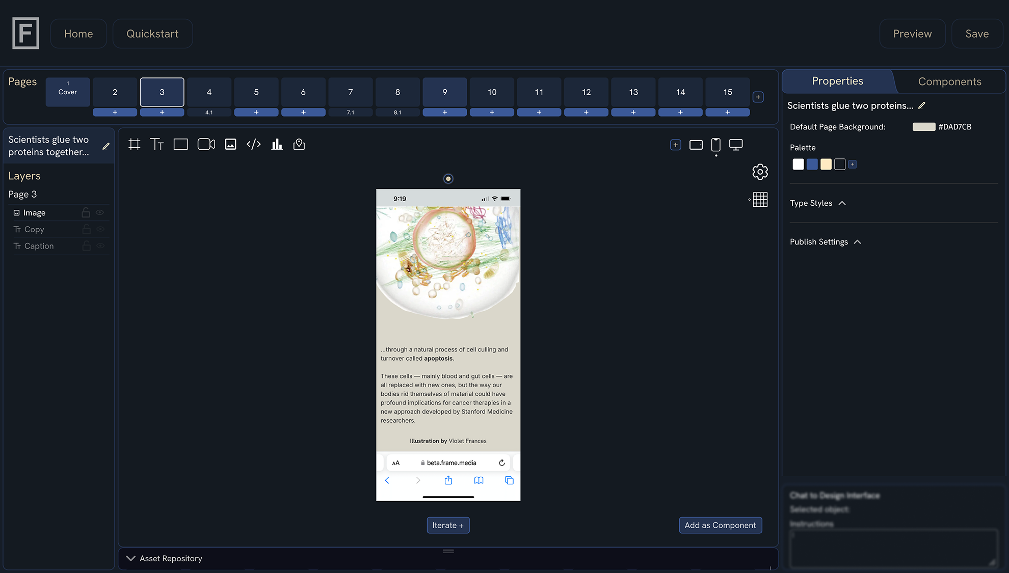
Along the way, we ran prototypes with publications including Stanford Medicine Magazine, The Conversation, BCG, and NPR. After implementing AI to aid in the upfront allocation of content across pages, we put together polished articles in as little as two hours, with initial layouts in minutes.